Google Calendar Redesign
Project Management // User Research // UI/UX // Prototyping // Competitive Analysis
Product Design Project
UC San Diego (DSGN 1 - The Design of Everyday Things)
January 2019 - March 2019

Background
Google Calendar, a popular calendar app used by many individuals to keep track of events and organize their schedules. Popular for its design and its notifications, Google Calendar’s main features include creating reminders and events. However, there are still aspects of the design that are hard to navigate and could be improved. As college students who frequently rely on scheduling applications to keep track of our busy lives, my group of six decided to redesign the Google Calendar app.
User Research
When analyzing the Google Calendar app, our group focused on iPhone users. This was done to keep features and usability consistent, as the android version has a slightly different format for its features.
Our team interviewed a total of 19 UCSD students on an activity to further identify the trends of users. We hypothesized that we would be able to see similar trends and analyze the data more effectively when pulling data from a similar demographic. We also chose to ask students because, as students ourselves, we know how often the G Suite is used for various class assignments. Some of these students had experience using Google Calendar, but others had no experience. We interviewed students from both groups so that we could analyze if certain errors were a rookie mistake or a design issue.
We attempted to learn about the participants’ prior technological experience, their ability to execute tasks, their purpose for using Google Calendar, and their conclusions about the products’ design and usability.


Problems and Trends
From the interviews we conducted, we were able to analyze the general design of the Google Calendar app. We noticed that the overall layout of the interface is discoverable and most features fit the mental model of the user. However, we did notice some common errors made among users.

Figure 1: User clicks on March 11 on the calendar to create an event, but instead is led to the scheduling interface.
Error 1: Trying to add an event
One common error we noticed among 8 of our 19 interviewees was that they tried to manually edit the event date after its creation. This happened because the user would press a date to create an event on that date but an event would be created on a separate date and the user would have to manually change the date. This error would usually happen on the month mode of the Google Calendar app. Additionally, 3 of 19 interviewees tapped on a day intending on creating an event, only to be led to the scheduling view as shown in the gif below.
This is a significant error because it occurred among new users and users that rarely used the app, which means that most people hold the mental model that they need to press on the date to customize a new event, which does not match with the conceptual model of the designer. This could be because on physical calendars or planners, users directly write on the box where the date is located, so they are initially drawn to the box with the date. In fact, 8 of our 19 interviewees used physical planners.
Error 2: Setting the event to repeat
Another issue people had with the activity was setting the event to repeat properly. On the iPhone Google Calendar interface, the option to change the frequency of the event is hidden under a 'More options' button (see Figure 2).
As a result, 10 interviewees out of 19 had trouble figuring out how to follow our instructions when we asked them to set the frequency to once every three days. During the activity, users would scroll up and down to find the repeat option. They would eventually click on 'More options', which would reveal the time zones and the repetition feature (see Figure 3).
However, users would get confused by the phrasing of the repetition feature: 'Does not repeat'. 2 users said out loud “does not repeat,” sometimes multiple times, expressing their confusion. It sounded like the event itself was not capable of repeating or the description was only a notification that the event does not repeat and the feature to change that is elsewhere. Users would evaluate that that was not the correct feature by its confusing description and scroll again.
Many events in people's lives are repeated like classes, work shifts, or appointments, so this feature should be easily discoverable.


Error 3: Setting the event to end after 10 repetitions
The last common error we observed in 5 out of 19 interviewees was that they would have trouble figuring out how to end the event after 10 repetitions. On the iPhone interface, the feature to do this is located in the page where users can customize the repetitions of the event (Figure 4). This page itself is already hidden and can only be accessed once they click on the 'More options' button as discussed in the previous error (see Figure 2). Once they are on this page (Figure 4), users need to tap on Custom in order to see the feature which allows them to customize when to end their event. The path to this feature includes two “page changes,” both involving a hidden “Other” feature. If users do not make the connection that “setting the event to repeat” and “ending the event after 10 repetitions” are similar features enough to be located on the same page, they would be confused as to where they can end the event, which is exactly what occurred.
One experienced user reflected after the activity that the app is “a little cluttered and hard to find all the settings,” while two new users reflected that the “end occurrences” feature could be more clear or be a separate button. The feature to end the event after a certain number of occurrences does not have good discoverability.
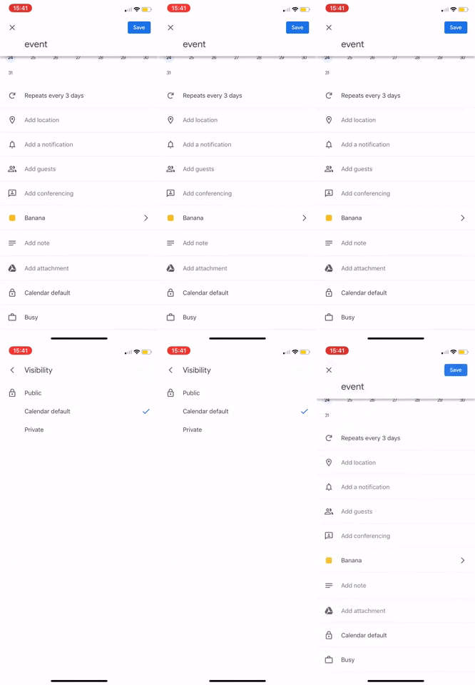
Figure 2: This is the normal interface while creating an event.
Figure 3: This is the interface after clicking 'More options'.


Figure 5: This user clicked on visibility when trying to find the "end event" setting
Figure 4: This is where users can customize repititions of an event.
Paper Prototypes
The next step of the design process was to paper prototype redesigns based on the three main errors we observed.
Redesign the monthly view:
(Error 1: Trying to add an event)
Because users kept tapping on the day to add an event, we considered a redesign where if users tapped on a day, a pop-up menu with two options would appear. The two options would be “view” to view the schedule for that day, or “edit” to edit the day, including adding events, etc.


Redesign custom repeat settings:
(Error 3: Setting the event to end after 10 repetitions)
The screen following this one would be if the user tapped on the repeat options button. We got rid of an intermediary screen and went straight to the customized repetition screen because this screen actually includes all of the options on the previous screen and more. Additionally, we decided to put the “Ends” option on the same screen to prevent confusion about where to find the end settings.
Redesign add event screen:
(Error 2: Setting the event to repeat)
We wanted the “Repeat options” button to be much more visible compared to the original design, which concealed this setting as part of “more options”. For our alternative design, we considered also adding labels that would say “start” and “end” on the two dates, to make it easier for users to tell what dates they were editing. We ultimately didn’t go with this alternative design, because it would just end up cluttering the screen more.

Competitive Analysis
After identifying common errors, we decided to analyze tradeoffs associated with not only the Google Calendar app, but also similar alternatives like the Apple Calendar and the physical planner. These analyses helped us identify what we wanted our redesign to look like.
Tradeoff #1: Compactness versus Discoverability

Figure 6: Design Space - Compactness vs. Discoverability
Apple Calendar app
-
Both the repeat and end repeat options are shown in the new event page, making it less likely for users to miss these options.
-
While Apple Calendar does not offer the “end after number of occurrences” option, the available options are not concealed and are directly shown to the users, leaving no ambiguity.
Therefore, Apple Calendar receives a compactness rating of 3 and a discoverability rating of 4.


Figure 7: Apple Calendar's "New Event" page
Physical planner
-
Not compact; is a physical object and therefore needs to be carried around.
-
It is impossible to conceal functions on a physical planner.
Therefore, it has a compactness rating of 1 and a discoverability rating of 4.

Google Calendar app
-
Error 2 and 3 are both caused by a significant function being concealed under an option that does not indicate any relevance to the function itself.
Therefore, Google Calendar app has a compactness rating of 4 but discoverability of 2.
Our Redesign will see the lack of discoverability as a problem and values discoverability over compactness. We score our redesign with a 5 in discoverability and a 3 in compactness.
Tradeoff #2: Simplicity versus Artwork

Figure 8: Design Space - Simplicity vs. Artwork
Apple Calendar app
-
Employs a very minimalistic design. The default view is simply composed of all the days in the entire year.
-
The interface design only uses two colors, red and black to convey everything
Therefore, it has a simplicity rating of 5 and the artwork rating of 2.

Figure 9: Apple Calendar's default view
Physical Planner
-
Some planners use more artwork to achieve a stylish look while some stick to a minimalistic design.
-
Because of the variability of planners one can get on the market, the physical planner’s position on this design space cannot truly be determined.
We have a rating of 3 for both categories.


Google Calendar app
-
Different artwork for each month depicting different seasons. For example, December has an artwork depicting snow and a person skiing; April has an artwork depicting springtime and people playing on a grass; June has an artwork depicting people swimming in a pool in the sun.
-
These artworks add a warm atmosphere to the interface and make the user experience more enjoyable.
Hence, it gets a rating of 5 in the artwork and 3 in simplicity.
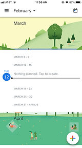
Figure 10: Google Calendar's default view
Our Redesign
-
We seek to keep the artworks while keeping the interface as simple as possible.
-
We score our redesign with a 5 in artwork and a 4 in simplicity.
Redesign
MONTHLY VIEW REDESIGN: The first aspect we chose to redesign was the monthly view of Google Calendar. Instead of taking the user directly to the scheduling view, which can be misleading, we made it so that a pop-up window would show up if the user tapped on a specific day in the monthly view. Below is a comparison of the current Google Calendar interface on the monthly view after the user taps on a day of the month, and our high fidelity redesign:

Figure 11: Current interface
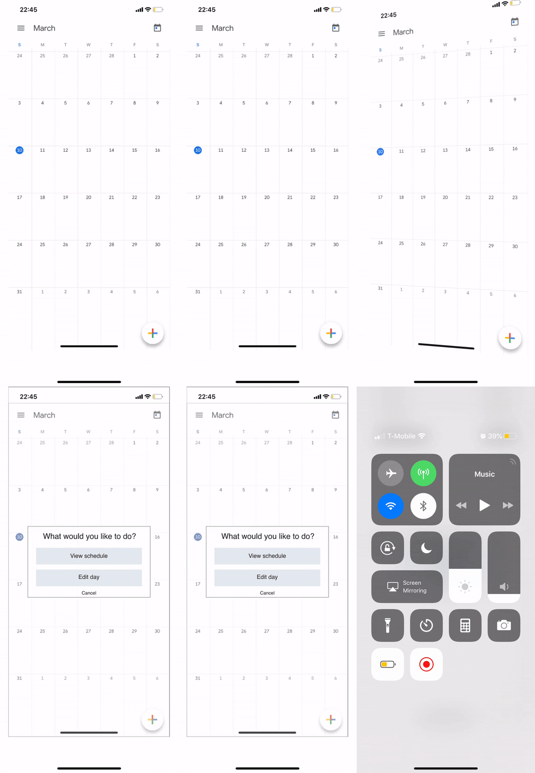
Figure 12: Redesigned interface. Clicking on a day in the calendar would lead to a pop-up with options.
REPEAT EVENT FEATURE REDESIGN: The second aspect we redesigned was the visibility of the event repetition option after the user taps on the “create event” button. In the current interface of Google Calendar (shown to the left), the user must tap on the plus symbol to create an event, and then click on “more options” to see the setting to adjust for repetition. In the redesign (the gif on the right), we get rid of the “more options” button and directly show the setting. The trade-off for this is increased clutter for higher discoverability. We also changed the wording to just say “Repeat options” which is more straightforward.

Figure 13: Current interface

Figure 13: Redesigned interface which contains 'Repeat Options' rather than 'More options'
CUSTOMIZE END EVENT FEATURE REDESIGN: The third aspect of Google Calendar that we redesigned was the feature of setting to end the event (whether after a certain number of occurrences, on a specific date, or not ending at all).
In the redesign, we changed two things.
-
First, we removed the screen with the preset repetition settings, because the custom screen has the same options. In getting rid of this intermediate screen, we decrease the potential mistakes that may occur. In addition, this makes the custom repetition setting more discoverable.
-
Second, we moved the setting used to end the event repetitions to be on the same screen as the custom repetition screen. This way, users are less likely to miss the setting when planning out their events.
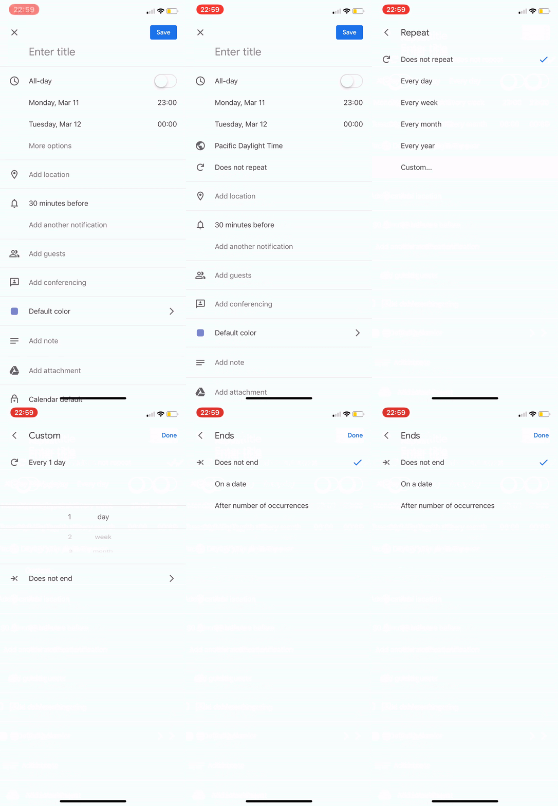
Figure 14: Current Interface
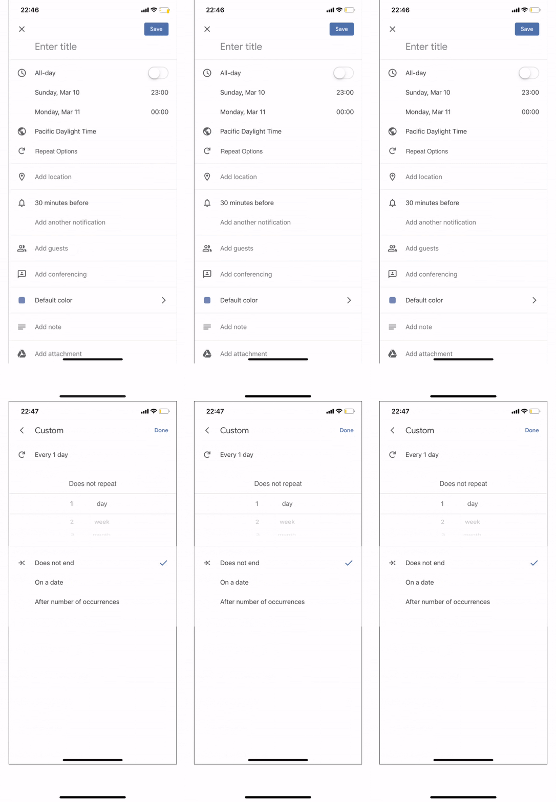
Figure 15: Redesigned interface contains all repetition features on one page
Reflection
We chose to redesign the Google Calendar app because as college students, we all thought it was important to have a well-designed scheduling interface that organizes all the activities in our busy lives. If we were to continue this project, we would begin by testing our redesign and continuing to iterate. We could also take into account the differences between iOS and Android users, adding another layer of complexity.
I learned that the design process is continuous as designers strive to achieve the most “perfect” version of their product as possible. In addition to learning about new design tools like POP and Adobe Illustrator. I gained more practice in working with a large team, giving constructive feedback to other teams, and presenting our project in class. The design process was my number one takeaway and something I will bring into all my future projects, regardless of them being design-related! This class was my first dip into the design world and I came out as a budding designer.